Leuchtturm1917 vs Moleskine – The Bullet Journal Watercolor Test
Articles may contain affiliate links.
Watercolor Obsessed
If you’ve followed me for any amount of time, then you know I love my watercolors. I use them in my bullet journal constantly. This is a source of much curiosity for many of my readers and followers. Well, today I’m going to experiment with two popular journals used in the bullet journal community – the Leuchtturm1917 and the Moleskine. I put them head to head with a bullet journal watercolor test and recorded it all meticulously. So let’s see how these two beauties performed, shall we?

Materials Used
Before we jump into the nitty gritty of the experiment, here’s all the supplies I used in this very thorough watercolor test.

Journals
Paints and Inks
Dr. Ph. Martin’s Hydrus Watercolors in a Loew Cornell Palette
Finetec Watercolors – Gold Palette
Liquitex ink! Iridescent Rich Copper
Dr. Ph. Martin’s Bleedproof White
Dr. Ph Martin’s Black Star India Ink
Brushes and Pens
Oblique Pen Holder and DP41BR Crown Nib
Pigma Micron (for notes)
The Basic Bullet Journal Watercolor Test
I used watercolors in two pages in both the Leuchtturm1917 and the Moleskine. The first page of each was the basic test, with only a few color swatches. The second page was the stress test. Let’s check out the first page with the basic bullet journal watercolor test first!
The Hydrus Paints
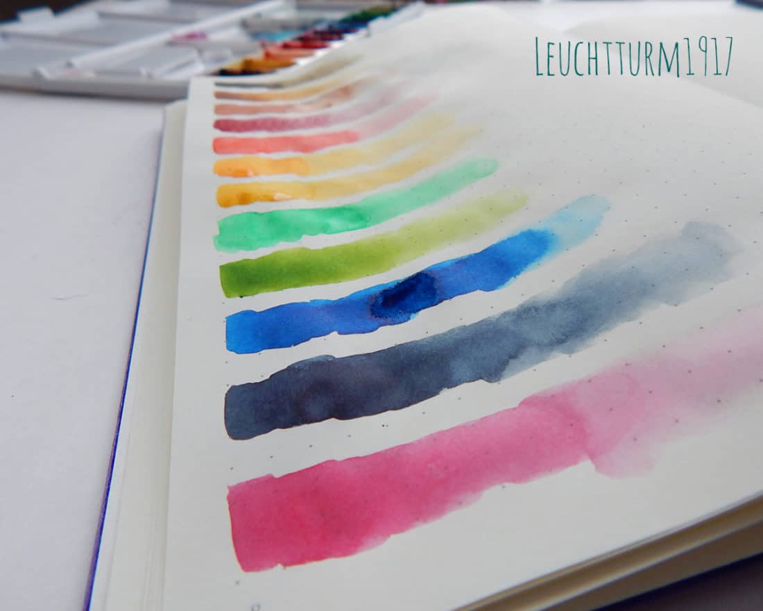
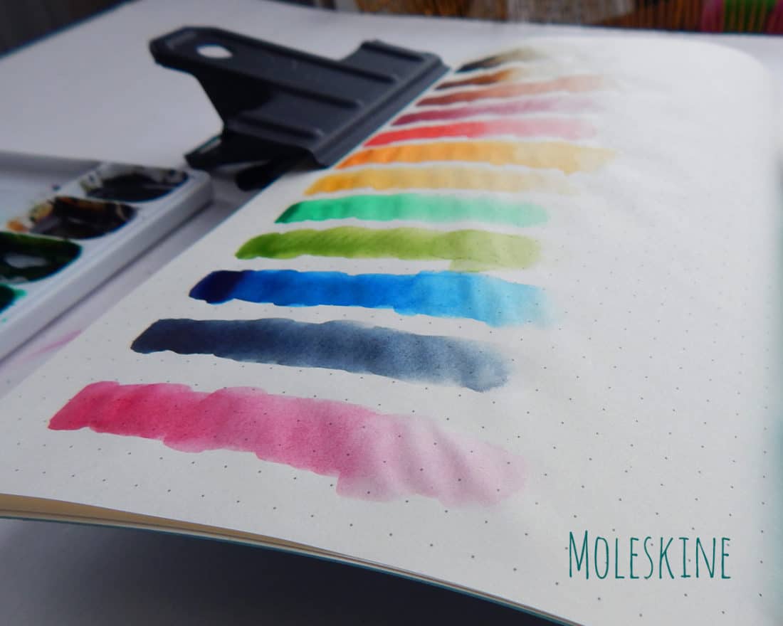
After I got my Hydrus paints ready in my palette and I prepared my work space with a few paper towels, I was ready to go. I used the Aquash brush pens to create a gradient swatch for each of the colors on the pages of both journals. I used water pretty sparingly for these, which is how I typically use watercolors in my journal.


As you can see from the pictures above, both journals seemed to do fine. There’s a bit of paper warping directly where the water touched it, but nothing ridiculous. So far, so good. Now let’s move on to the more exotic sample of paints!
The Metallic Paints
Next, I tried some of my favorite paints – the Finetec gold palette! These beautiful colors are fantastic for lettering, calligraphy, and accents – but it has a slightly different set of ingredients due to the metallic components. So how did it do in the journals?

I painted little square swatches in both journals, including two extras – the Liquitex copper and the Bleedproof white. Both the Leuchtturm1917 and the Moleskine did fine with these, too! It does look as though the Moleskine samples are a little bit more smooth, while the Leuchtturm’s samples puddled a bit. So perhaps the Moleskine can handle the thicker paint with a bit more ease?
Did It Bleed?
Here’s the big question. Did these watercolors bleed through the page or ruin the page before it? The answer is…


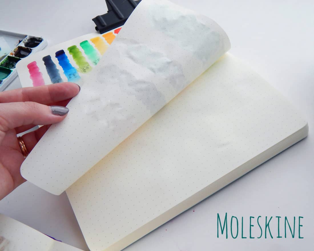
Nope! Neither the Leuchtturm1917 or the Moleskine show any signs of bleeding. Each journal has some ghosting, but only as much as any dark pen would. Both journals’ pages are a bit wrinkly, or “crispy” as I like to say. But the watercolor didn’t damage the back of the test page, nor the next page it touched.
Okay, all of that was nice, but it was the little leagues. Let’s see how they handle the big boy bullet journal watercolor test!
Enter the Fox Den Resource Library
Subscribe to get access to 40+ pages of printables, brush lettering worksheets, and more!
The Stress Tests
The first page was easy. That level of watercolor is pretty on par with what I use on a regular basis – no crazy blending, no layers, no excessive water. But I wanted to push these journals to their limits and see what happened. For science, of course.
Just a note – I’ll show details of each technique as I do them, but hold tight until the end for the final pictures and analysis. Otherwise this post would be absolutely stuffed with images and it would load slower!
Test #1: A Simple Blend
With this technique, I used my Aquash brush pen to pick up some green paint. Then I started on the left, gradually working my way right while getting a more diluted colour as I went. Next, I picked up blue and did the same, but from left to right. This technique mixes two colors in for an ombre effect. It’s a simple, basic bullet journal watercolor method, but it requires that each paint stay wet while you mix them.

Test #2: The Wet on Wet Blend
This effect is fairly simple in nature, too, but requires a very wet page, which is a bit scary and may feel like too much water on non-watercolor paper! First, I created a layer of clean water. Then, I loaded up on blue, which I touched to the wet paper in several spots. The blue blossomed out into the clean water. Then I did the same with red paint. The two colors blended into each other softly, creating a very cool watercolor effect.


Usually, I dab away the standing water with a paper towel after the colors have been put down on the paper, but that takes away a lot of the pigment. I have never left that much standing water dry naturally in my journal – but this time, I did. Eeek! It took probably 20-30 minutes for them to dry completely.
Test #3: The Black and White Test
This test required a flat wash of India ink. Why would one need to do that in their journal? I don’t know, this is an experiment! Science! Data! Just go with it, okay?
In each journal, I put down a swatch of Dr. Ph. Martin’s Black Star Ink and let it dry, which took no time at all. Then I grabbed my Dr. Ph. Martin’s Bleedproof White (which is watered down a bit to make it thinner) and lettered on top of the ink using my Aquash brush pen.
I noticed an interesting little detail in both journals that I thought I’d mention here. The dots on the page sometimes peeked through the ink or paint, like in the image below. Neat, right?

Test #4: Just Absurd Amounts of Water
This bullet journal watercolor test isn’t really a technique so much as a stress test. I wanted to see what would happen if I just painted with a riduclous amount of water, then wrote over it. I laid down an extremely wet wash of orange and let it dry completely. Then I lettered over it with the rather wet Pentel Pocket Brush Pen. I was curious if the abuse of water would make the wet, black ink bleed through the page or ghost in any way.
Again, the results are at the end of this post! Just keep scrolling to see the final images 🙂

Test #5: The Wet Nib Calligraphy Test
In this final test, I used my nib calligraphy pen with watercolor as the ink. I was curious if having super concentrated watercolor in a very small space, mixed with the pressure of a dip pen, would push it to bleeding through the page. I used the Aquash to load the watercolor onto the nib by brushing it on the nib’s belly. Then I simply wrote on the page of both journals and let it dry.

The Results
So how did the journals do when they were all dry? Take a look!

The Moleskine
Test #1 (with the blue and green blend): The blend went perfectly fine! It was able to handle that level of water no problem. I made a note that the next page seemed to have a bit of moisture, but after a few minutes, it dried and ceased to be a problem. Like I said earlier, there was a slight gritty texture, but it’s just a quirk of the different paper.
Test #2 (the wet on wet blend): This test actually wasn’t as bad as I thought. It took forever to dry, but it looks super cool. My only complaint here is that the paint didn’t really want to spread out in the wash of clean water. I had to push it around a little bit to get it to expand into the full swatch. But in the end, it blended fine.
Test #3 (the black and white test): It all turned out great in the Moleskine! The ink wash was a total non-issue, and the layer of Bleedproof white didn’t cause any problems at all. It all went smoothly!
Test #4 (the stress test): This test also didn’t seem to be a big hangup. The watercolor dried fine, and the lettering with the Pocket Brush Pen didn’t seem to be a big deal for the journal.
Test #5 (the watercolor calligraphy): Again, the Moleskine performed admirably. The calligraphy turned out just great.

The Next Page
So how did this crazy bullet journal watercolor test affect the next page? Take a look.


Okay, so pretty funky. The back of the test page was wrinkly, distorted, and crispy as hell. Plus the ghosting was a bit crazy. But the following page was still fine! There were a few spots where there was some moisture, but it was incredibly minor. All in all, it did great. Despite my abuse of water and allowing swatches to dry naturally, there was no bleeding to speak of. And that’s pretty awesome.
The Leuchtturm1917
Test #1 (with the blue and green blend): This test was pretty much the same as the Moleskine. It did great!
Test #2 (the wet on wet blend): The watercolor seemed to pool in spots worse than the Moleskine, but if I’m being honest, I like the finished result much better in the Leuchtturm1917. It turned out super cool! The paint was much more willing to disperse without me pushing it around, so maybe that’s why it dried so neat.
Test #3 (the black and white test): Now that this test is done, I can’t believe I was actually worried about this one. It handled everything like a champ. And the ink dried a little glossy, which is kinda neat.
Test #4 (the stress test): I’m happy to say that nothing of note happened here, either. The paint dried, I brush lettered over it, and everything was good.
Test #5 (the watercolor calligraphy): The lettering took a while to dry because of how wet it was when I wrote everything out, but other than that, it went perfectly.


The Next Page
Did the bullet journal watercolor test push through to the next page of the Leuchtturm1917?


And here, ladies and gentleman, is one of the reasons I love the Leuchtturm1917 so much. The next page is gorgeous. Yes, there is some distortion on the back of the test page, but it’s incredibly minor. There is some ghosting, but again, it’s insignificant. I’d get these results with a dark brush pen. Despite not being a watercolor journal, the Leuchtturm1917 can take quite the watercolor beating.
Warping Comparison
Because neither the Moleskine or the Leuchtturm1917 are watercolor journals, they are going to warp to some extent. As you can see in the photo below, The Moleskine didn’t handle it as well the the Leuchtturm1917. With the exact same test between them, the warping is more significant – and it even slightly affected the page behind it! The top corner is pulling up a little bit, too.
In comparison, the Leuchtturm1917 warps very little. It is a bit wavy, but is quite minor. I’m quite satisfied with the level of sass the pages gave me after the stress I put them through. The Leuchtturm1917 definitely took it better than the Moleskine.

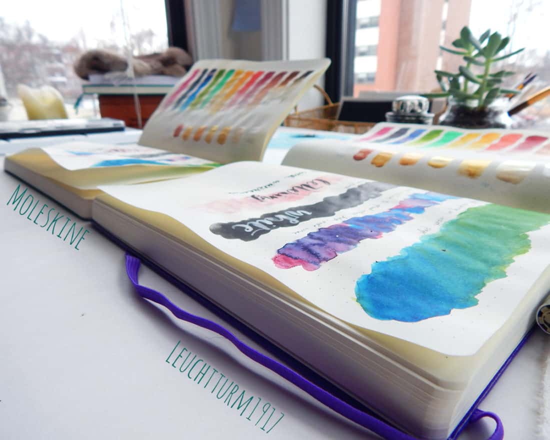
However, it should be noted that the warping lessens after you close the book for a while. For example, here’s the Moleskine, Leuchtturm1917, and my active bullet journal (also a Leuchtturm1917). In my bullet journal, I’m about halfway through the book. I use watercolors frequently, and I have since the beginning. See how bad the warping is? It’s really insignificant. That’s because after the journal is closed for a bit, the page straightens itself out once again until only a little bit of warping remains.
It also should be noted that I’m using a softcover Moleskine and a hardcover Leuchtturm1917. That does make a difference when it comes to smoothing out pages over time. Just something to keep in mind!

Final Thoughts
Both the Leuchtturm1917 and the Moleskine performed better than one might expect with the bullet journal watercolor test. But in the end, my loyalty sticks with my trusty Leuchtturm1917. I love using watercolors in my bullet journal illustrations, and knowing that the Leuchtturm notebook can take this level of watercolor graciously is too good to be true.
For anyone who is nervous about trying watercolors in your journal, I want to say this to you: it will be okay! Your journal paper can take more than you think. If you are concerned, try out some watercolour swatches on the last page of your journal. Have paper towels on hand. I promise, the worst that happens is that you don’t like having crispy pages and you decide to not do it again. If these two journals can take the bombardment of water that I just threw at them and not fall apart, then your journal can handle a bit of watercolors. Just go slow, be a bit careful, and slowly push the limits of your comfort level. You will discover that this technique is fun, simple, and not a death sentence for your journal – I promise!


I have heard both brands use thinner paper…have you done a updated test to see if they still hold up?
Not yet, but it’s overdue!
HOW did you get it not to bleed?! My page looks awful on the reverse and ruined that page! I have the Leuchtturm1917 and use dual tip watercolor markers and water. I wish I could upload a photo to this comment!
Hmm, that’s strange ? Are you certain they are watercolor markers (or water based ink)? Alcohol based inks bleed straight through most papers, and alcohol markers are common at stores and such. It could also be that you’re using too much water and not blotting away the excess, which could result in bleeding through. Or maybe that particular marker just doesn’t get along with that paper. It happens sometimes! ?
I’m sorry you’re having issues with this, I hope you get it cleared up!
I’m having the same issue. I’m using Tombow brush pens, and I tried with both a water brush and with the provided blending pen, and both tests resulted in the same issues Lauren described above. It sucks, because I got some beautiful blends in my mixed media notebook. 😭
LOVE this website. I’ve been trying to figure out what pen/ink you use when you write on top of watercolor. I’m new to this so apologies if I get this wrong, but it seems to me that if you use the TomBow, which is water soluable, the writing will bleed. Is that right? So should I use a water resistant pen/ink instead, such as the Sakura pigma or a Copic? I know you recommend the Pentel Arts Pocket Brush pen in places, and I believe that’s water resistant, but the reviews on Amazon suggest that pen is not a good one for a beginner. Thanks for any advice and for your terrific website!
Thanks so much, Rebecca! If you’re writing on top of dried watercolor (and I mean TOTALLY dry), you should be able to use water-soluble pens and markers like Tombows. But if you’re writing first and applying watercolor over it second, then you need something that is not water-soluble. I have had great success with the Sakura Pigma Micron pens. Personally, I’ve never tried the Copic drawing pens, so I can’t say from experience whether they’re good for this task. I’ve also found that the Pentel Pocket Brush Pen is excellent for this use, but you are right in that it might be a bit tough for a beginner since it has loose bristles instead of a felt nib. It’s only really good for lettering or drawing, not for writing anyway. If you’re just beginning, my suggestion would be to try the Sakura Micron pens — they’ve been my go-to for years!
Hi
silly question how do I log in and where do I log in to see the printables and worksheets
Hey Liz! You can head over to https://littlecoffeefox.com/resource-library to log in. If you’ve signed up for the mailing list you should have received an email with the password. If you did sign up but didn’t get the email feel free to shoot us a message and we will get you taken care o!f!
This is an amazing comparison! I was wondering if you could share how you made your palette with the hydrus colors. I can’t seem to find any tutorials around showing how best to dry it down and such 🙂 thank you!!
Thanks so much, Shay! I don’t really do much of anything, actually. I just use the palette that I have listed in the materials section and add a few drops of paint to a well. I only add as much as I think I’ll use in that session. Once it’s in the palette, I can water it down as much as I need. That’s pretty much all there is to it! The next time I want to paint, I’ll either use what’s left over in the palette or add more. I hope that helps!
Very Cool! And on the ghosting side you can easily glue a printable or something on top if you don’t want to write on that page..that’s what I do often. I just ordered some of those pentel water pens last week can’t wait to try them out!
You can totally do that Beth! I’d love to know how you like the pens when they arrive.
Thank you so much for the testing. I enjoy looking at your Instagram page, and all the work you do it’s very pretty. I started my first ever journal last month but since I’m on a budget I started with a graph composition notebook. How do you think it would hold up to watercolor…???????
Thank you Blanca! I think the pages of a composition book are a bit too thin to really hold up well to watercolors unfortunately. You may be able to try it and then glue a couple of the pages together so the watercolor doesn’t show through as much.
This is really useful information, thank you. I’ve just started experimenting with watercolours in my journal. Do you leave a blank or non watercolour page in between each page you paint on? I imagine painting on each side of the page is too much? I hope this question makes sense!
Hey Gemma, I’m glad to hear this was helpful! There aren’t any pages that are skipped. You can watercolor on both sides of a page and it’s totally fine.
Hi Shelby,
This is the best test ever. I was wondering about doing some watercolor in my bujo but did not dare until now. Thanks to you, I will.
Thank you so much.
I’m so glad to hear this was helpful for you Anne!
This is so helpful! Thanks! I wanted to paint watercolor planets on a cover page, but I didn’t want to have it be on seperate paper glued in. I have used an iron to flaten paper before that’s been warped. I think a layer of parchment paper and and Iron would straighten the page right up instantly! I can’t wait to try it now.
I can’t wait to hear how it goes, Jessica!
I love your blog!! I’m so looking forward to trying this. I had I minor in water color but haven’t picked up a brush in ages! I used a blow dryer for quich dry and starting areas close to last area. Thanks for sharing your beautiful work!
Thanks so much Katt! I’m excited to hear you’re ready to pick up that brush again!
Useful experiment. Thanks. As a collage artist who paints my own papers I learned to use a regular clothes iron to smooth crinkly papers. It works on dry journal pages too. Use the cotton setting.
That’s a great tip, thank you Jo!
Thanks for the trial =) I have a moleskine and was a little worried about triying watercolor on it xD
Next month will be full of watercolors in my bujo ~
I’m glad you enjoyed the post, I had a ton of fun doing it! 🙂
Thank you so much for this post !
I just acquired a Leuchtturm 1917 and I’m kinda addicted to watercolor, so, when I saw the paper, I didn’t really know what to do, as I don’t want to damage it.
I’m way more relaxed now, so I won’t use a lot of watercolor in it but won’t hesitate to be fancy neither ! It was a really good idea to make this article, thanks again !
(excuse my eventual mistakes I’m currently learning English, I hope it made sense ahah)
Your English is fantastic, Elisa, so don’t worry about that! And I’m so glad that you feel more comfortable giving watercolors a try in your Leuchtturm. It’s super scary at first, but once you try it, you’ll be addicted 😉
This is great! I have my watercolor brush but have been nervous about starting. Thank you for giving me more confidence!!!
I’m glad this is the kick you needed, Christina! I promise you it is super fun and totally doable. You’ll love it!
I might use watercolors in an art journal but the ripple effect in my bujo is not acceptable. But I focus on productivity not decoration. If art is your thing, why not use a multimedia journal instead of one designed for writing?
This was great information.
That’s a great question, Judith! The reason I incorporate artistic elements into my bullet journal is because I wouldn’t use it otherwise. I tried using a “productivity focused” planner my whole life and I couldn’t make it into a productivity system. I used the bullet journal for two years before I started adding these artsy touches and it wasn’t making me happy back then. It was only when I started adding color, lettering, and watercolor that I began to use it every day because it was something fun and enjoyable, not a tedious task. For me, without the artistic side, there would be no productivity.
If you don’t want the warping in your bullet journal, I totally understand that. Plenty of people would be bothered by it. But I love mine feeling broken in and seasoned.
Shelby, I loved your thorough demonstration of how these journals held up to watercolors. This is just what I needed to know, thanks a bunch!
I’m so glad you liked it, Patti! I had a ton of fun making this post, and I really hoped it would help answer some common questions about watercolors. Thanks so much for reading!