Faux Calligraphy – Learn How to Create Gorgeous Lettering the Easy Way
Articles may contain affiliate links.


Everyone loves beautiful calligraphy. It’s easy to see beautiful lettering and think it’s too hard, but truthfully faux calligraphy is surprisingly easy.
What is Faux Calligraphy?
Everyone loves some gorgeous calligraphy. It’s almost like the appreciation of this beautiful art is baked right into our bones. Perhaps it’s just a human thing. It’s easy to look at brush lettering and calligraphy and think that it’s only for the artistically elite. No regular person can pick up a pen and create gorgeous hand-lettering like that. The truth is, it’s not that hard to do. In fact, mastering the art of fake calligraphy is surprisingly easy.
Materials Needed
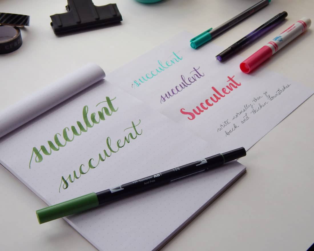
Faux calligraphy is essentially the same as normal calligraphy, except you can do it without all the fancy nibs or brush pens. Any normal pen or pencil will work! That’s what makes faux calligraphy so alluring – there is no cost to getting started. You can practice with abandon using whatever old pen you have lying around. However, I would suggest you invest in some simple dot grid paper to use as guidelines. Here, I use a Rhodia dot grid notepad. This is my go-to lettering practice paper because the dot grid allows structure without getting in the way.
While any old ballpoint pen will work, I suggest that you grab a pen that doesn’t have lots of goopy ink that sits on the page. Something that has a quick-drying ink is ideal, like Prismacolor Illustration Markers or perhaps a felt tip pen. You don’t want to smear your faux calligraphy all over the place!
The Basic Idea Behind Faux Calligraphy
After you have your pen and your paper, you are ready to begin.
First, write out a word. I would recommend cursive for consistency, but that certainly isn’t a requirement. Leave plenty of space between each letter. Here, I’m using one of my Staedtler Triplus Fineliners, which are perfect for this technique!

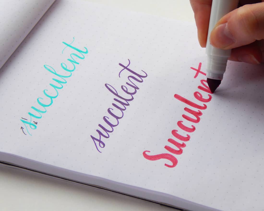
After it is written out, it’s time to put some weight on it! Using your pen, go through and thicken all the downstrokes. Not sure which strokes are the downstrokes? Hold your pen over the page and write the word in the air. Every time your pen moves down toward the bottom of the page counts as a downstroke.
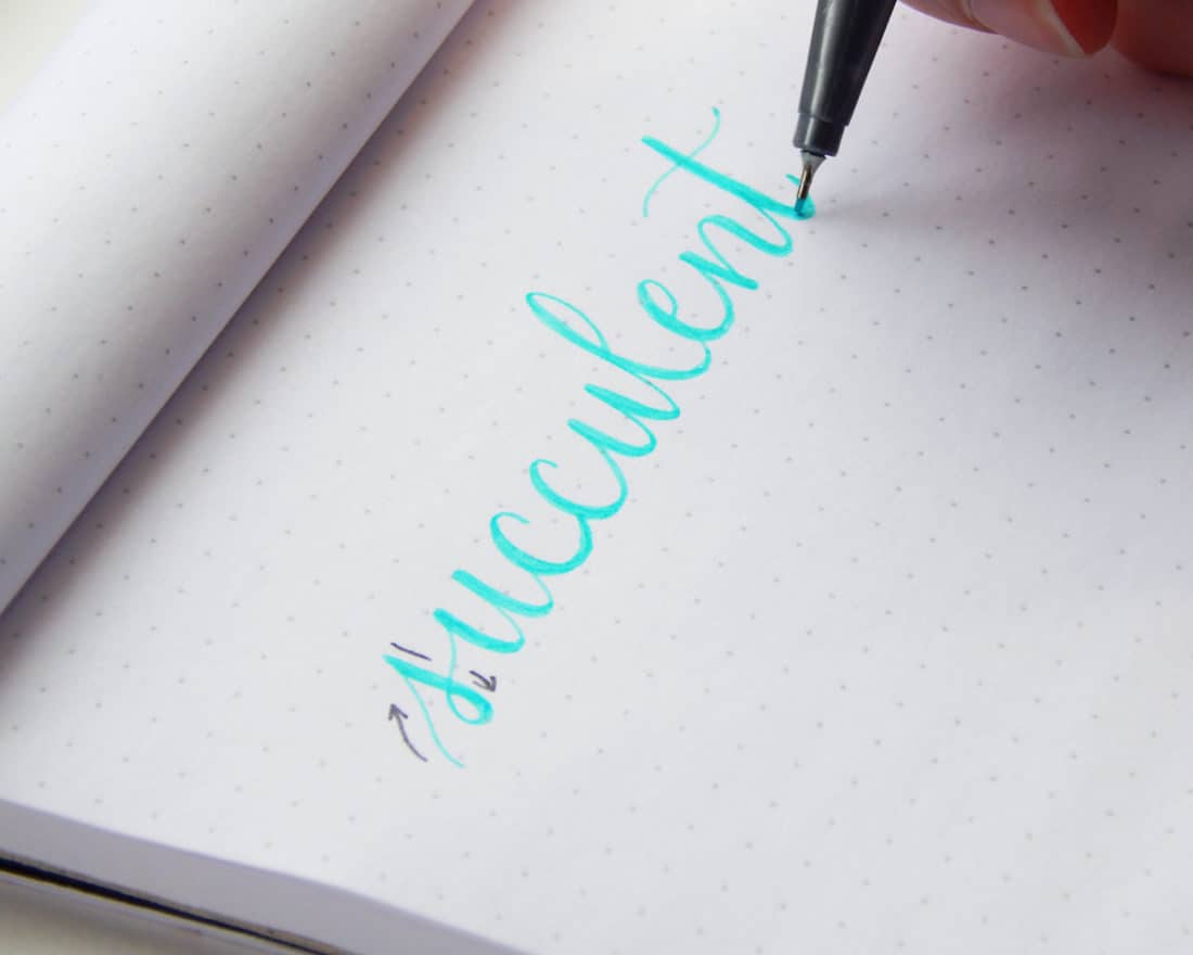
Making all the downstrokes thick while leaving thin upstrokes creates a lovely variation. That is the beautiful effect that is desired in brush lettering and other calligraphy styles. Adding weight to these lines mimics the effect, leaving a finished result of faux calligraphy!
Here is another example, but with a slightly different technique. You can also go through and mark where you plan on creating a thick line, leaving an outline of a hollow letter. Then, simply go through and fill in the gaps.
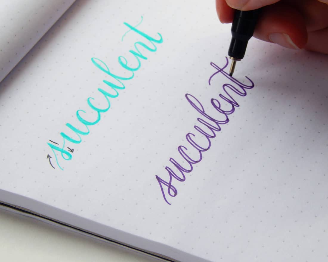
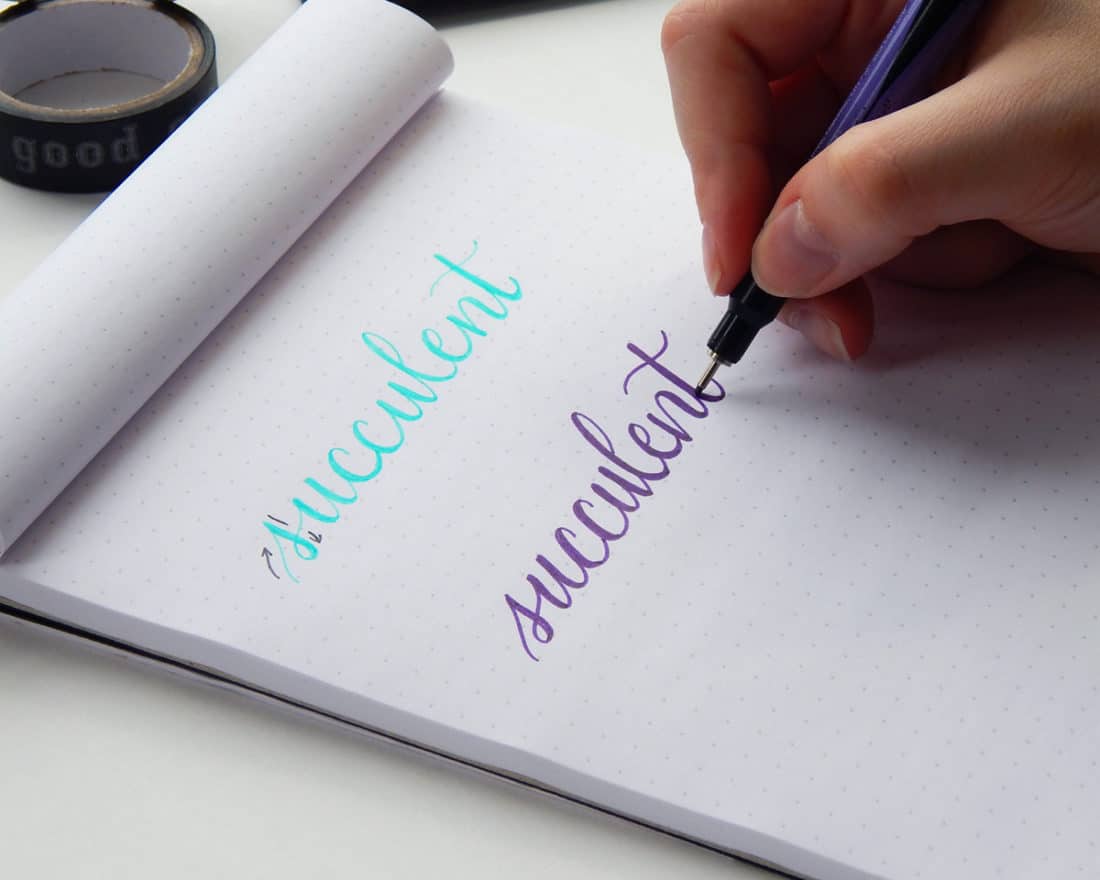
This variation is a great way to visualize the finished product. Bonus tip – you can even fill in the letters with a different color, or simply leave it hollow.
Let’s try yet another, but with a Crayola marker instead – and let’s do it in print! As I said, I think it turns out better with cursive, but it can still be lovely with print.
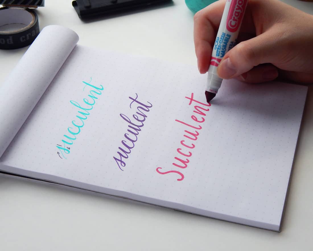
As you can see, the faux calligraphy technique is incredibly easy. Literally anyone can do it with just about any pen or pencil they want!
How Faux Calligraphy Compares
You may be curious how it compares to non-faux calligraphy. Here’s how it stands up to a Tombow Dual Brush Pen.

The top was created using the brush tip, and the bottom was created using the bullet tip. Obviously, it’s not quite the same. The brush tip is smoother, thicker, and has a gorgeous gradient in color. The faux calligraphy doesn’t look quite as neat compared to its pure blood counterpart. However, the draw to faux calligraphy is how easy it is to do for anyone, so it all levels out in terms of pros/cons. Really, it’s completely up to you.
There are times that faux calligraphy is a better choice for a project. For example, in my Master Grocery List, I use faux calligraphy for all the subheadings because they are too small for my big Tombow brushes. This might especially be true if you want to amp up the lettering in your bullet journal since the page would likely be smallish. Basically, faux calligraphy styles are extremely useful and flexible!
Crazy Simple
Isn’t that a ton easier than you expected? Faux calligraphy is a great launching point for anyone who is interested in hand lettering script but isn’t sure where to begin. It’s cheap, simple, and relatively quick. And while it isn’t quite a substitute for the real thing, it will definitely do the job in a pinch and serve as great practice for more complex lettering down the road.
I need to warn you though – this is the gateway drug right here. This is how I started. Fake calligraphy might seem like all fun and games, but you will thirst for brush pens soon. After that, you are lost to the cult of hand lettering. You become one of us. So join us and see where all the fun’s at! If you want to dive deeper into this weirdly addictive craft, check out my Brush Lettering 101 course for hand lettering beginners so you can learn all the fundamentals of lettering quick and easy! You’ll be whipping together beautifully lettered pieces of art in no time flat. What are you waiting for?
P.S. If you enjoyed this faux calligraphy tutorial and want to practice each letter of the alphabet, sign up to the Fox Den Resource Library here or in the sidebar and download your free worksheets and printables today!


Hi Shelby, I have been doing the free jumpstart course. I have been enjoying it. THank you for offering it for free. That is very kind. I got to you site through your faux caligraphy posting. I have a question about pens, is a Sharpie Precision marker a felt tip pen? That is what I have hanging around. THanks again
I’m so glad you like the course! I don’t have that specific marker. I don’t think it is a felt tip, but you should not have any problem using it for Faux calligraphy.
I hope that helps! 🙂
Awesome article as always, Shelby! Thank you for posting this for the world to share!!I have purchased the Speedball Art Elegant rite and I can’t figure out how I am supposed to hold hem to actually make them work! So frustrating for me. Your tip with the whole faux lettering though is right up my alley! I believe I can do that! Again, thank you so much! Maybe I will get bold and actually use the pack of Sergent brush markers now too instead of just having them in a special cup on my desk collecting dust!
We’re so happy to hear the tips were helpful Stormy! I know you can do it, and have fun with it too. I say go for those brush markers! There are some practice sheets in the Resource Library that are really helpful as you get going.
I wish you folks would be honest and tell students there is NO easy way to do calligraphy. It is the same as other skills….it takes years and years to perfect it….what you are showing is NOT calligraphy in the true sense of the word.
That’s exactly why this is called “faux” calligraphy — because this technique is a quick hack, nothing more! However, Joyce, if you read some of my other calligraphy posts, like this one ( https://littlecoffeefox.com/beginner-brush-lettering-tools-techniques/ ), you will see how much I talk about the need for practice to develop this skill. I never promise anyone that they will master lettering overnight. In fact, I regularly share how long it took me to get to where I am now, and that it will take years and years of practice for anyone who is serious about learning. What I do want to emphasize is that anyone can begin this hobby and that you don’t need some fancy formal education to join in. Yes, learning all there is to know about calligraphy is difficult and requires dedication, but this hobby is open to anyone with a positive attitude and a desire to learn. So if you aren’t interested in learning or encouraging others to learn, then you are free to find another tutorial that suits your needs.
I absolutely LOVE the quick and easy hack! I tried to learn calligraphy and teach myself after watching my mother take it in college years and years and years ago! I watched her spend HOURS and HOURS and HOURS learning the technique. And After years and years and years of success filing using legit calligraphy…..these days people tend to lean towards the faux calligraphy. because it is more stylish. and after all of that practice, she uses the faux calligraphy.
Great tutorial! Loved the structure and the simplicity of it 🙂
Thanks so much Max! Have fun lettering.
Ahhh this is SO GREAT I just tried it out in my bullet journal and I am ADDICTED. Thanks for the tip it’s awesome, great blogpost.
I really enjoy your site. I have learned alot reading it. Keep up the good work.
Thanks so much for being here Sooner ?
I have a TomBow pen, but I feel like the village idiot trying to use it because ALL of my lines are thick. I don’t understand, especially if I’m writing script and trying to connect letters, how to move from thin to thick lines. Am I’m holding the pen wrong?
That’s a super common problem, Christa, so you’re definitely not the village idiot! The problem might be with how you move the pen. Most people are tempted to move just their wrist, but when you move your arm from your shoulder, you can create more consistent lines and achieve the style you’re looking for! Try to get your whole arm involved and see if that helps a bit. Good luck!
Thanks for sharing this tip! This also seems a lot more fun than trying to exactly copy the style of lettering that everyone else uses, since so much of the hand lettering I’ve been seeing these days looks like it’s all been done by the same person.
I hope you have some fun with it Laura!
I have owned brush pens for a long time, they are wonderful. I first bought them for making Christmas cards. And I did some caligraphy but everytime I so enjoy the video’s. You learn something new every time ^_^ Sharing tips and tricks is great.
Thanks for being here Janneke.
I want to learn calligraphy
This is a great way to start! There is another post here that may be helpful as well: https://littlecoffeefox.com/2016/09/22/beginner-brush-lettering-tools-techniques/
I’m just starting out with bullet journaling and find your site very inspiring! When you thicken the lines, do you always go to the left or right of the original line or do you alternate depending on the letter? I would think it would make sense to do it from the same side (like shading) but when I’ve done it, I usually go back and forth depending on which side has more space.
I’m so glad you are enjoying the site, Nancy! I do what you do when it comes to thickening lines – I just do whatever side has more space. So you’ve got the right idea!
love this. I always do the shading in on the wrong stroke. I think i just write my letters weird.
I understand, Rosanna 🙂 You have to focus on your writing in a very weird way, completely different from usual. It definitely takes some practice, but I have no doubt you can make it happen!
Thanks Shelby, I really enjoyed your article… Now to read your Brush Lettering 101 post!
I’m really glad you enjoyed it, Mairead! This technique was so helpful to me learning the basics of brush lettering, so I hope you find it to be just as useful as you take the next step!
I can’t wait to try this style of writing! Which purple pen did you use for the hollow style of faux calligraphy? The pen and colour looks lovely!
Sophie
Thank you, Sophie! The purple pen is one of the Prismacolor Illustration Markers. They are a great set with fantastic tips, I’d definitely recommend them. You can’t go wrong with Prismacolor!