
Lettering Shadows: 9 Techniques to Add Dimension to Your Lettering
Articles may contain affiliate links.

Give it Body
With brush lettering, there are countless ways to add details and embellishments and make your work pop. For hand lettering beginners, one of the easiest and most effective ways to make your pieces stand out is with the use of shadows. Adding shadows takes your work from okay to amazing, and it’s not hard at all! There are so many ways to add shadows to your lettering, though. Where do you begin? Right here is a great place to start! I have compiled my nine favorite styles of brush lettering shadows that you can add to your calligraphy toolkit. I cover some super simple techniques along with a few more advanced ones, so read through and see which ones you want to add to your lettering!

Brush Lettering Materials
Tombow Dual Brush Pens
Tombow Mono Drawing Pens
Artline Drawing Pens
Signo White Gel Pen
My 9 Favorite Lettering Shadows
#1 – Monoline
This technique is as simple as it gets! Use a bullet tip or stiff-tipped pen to add a basic shadow to your letters. The monoline shadow creates a pretty subtle effect on paper, but it can be very effective for giving your letters dimension. In the photo below, I use a bullet tip to create a grey shadow
#2 – Monoline with Space
If you like the look of a monoline, then try this similar technique. Just keep a small space between your shadow line and the main letter to create this style. It suggests more depth than the plain monoline, but you need to be careful to keep the empty space uniform. The key is consistency!
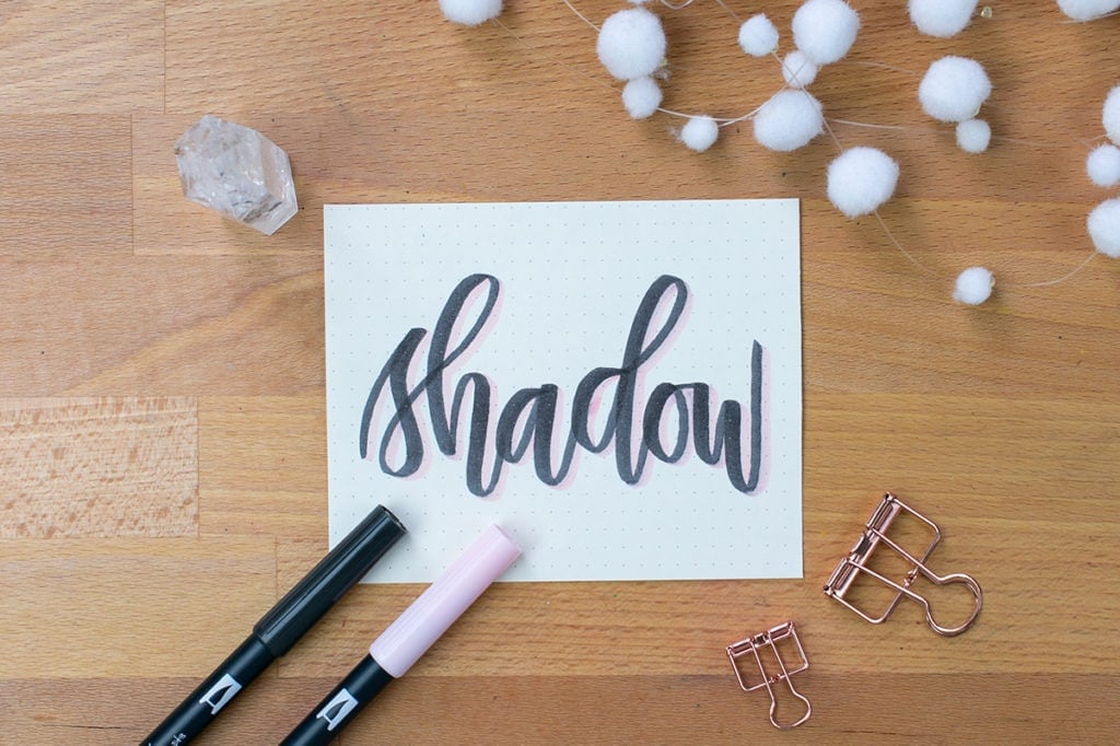
#3 – Brush Pen Shadow
Using flexible brush pens, use downward strokes to create a shadow along the right side of your letters. This type of pen gives you more control than a monoline pen over the fluidity of your shadow. Again, this style is very basic and is great if you’re a beginner.

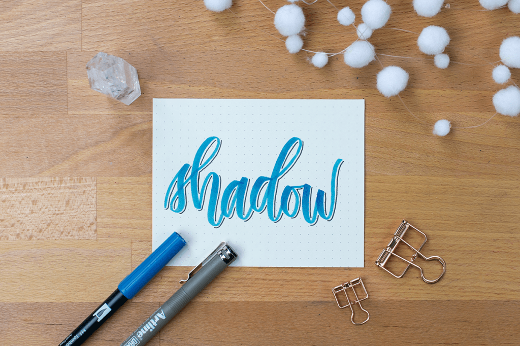
#4 – Outline with Shadow
Another way to kick up your shadow effect is to outline your brush lettering first using a thin pen. Then add a shadow with a brush tip pen to really make your letters pop. Despite being simple, this look is very striking and attractive.
#5 – Outlined Word and Empty Shadow
Begin by creating an outline around your letters with a bullet tip or drawing pen. Then go back and outline where the shadow would be. This technique is very cool, but it takes a bit of practice to keep from accidentally putting lines in the wrong places. You might want to try it with a pencil before you ink the shadow outlines.

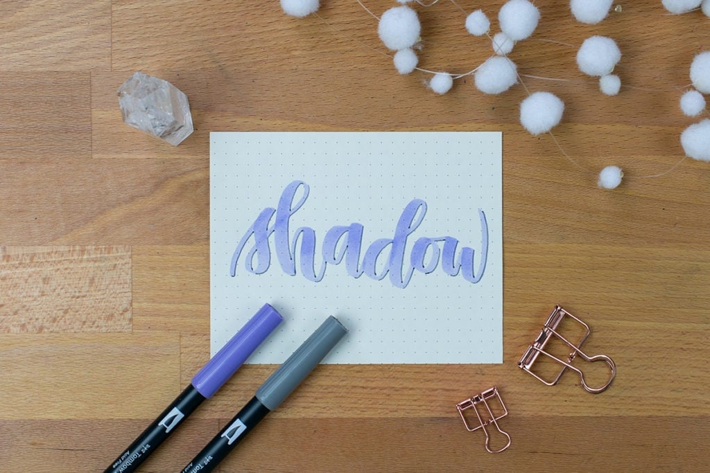
#6 – Color Shadow
Switch it up and make your shadow colorful! It’s easy to get set in the idea that you should add shadows that are grey or black. However, you can have a lot of fun creating different kinds of interesting looks by using varying pigments in your brush lettering shadows. Play around with contrasting colors, light and dark colors, and other variations.
#7 – Outline with Hatches
Take the concept from technique number five and create empty shadows on your letters. Then, using your drawing pen, sketch small lines (called hatches) in those empty spaces. Concentrate your hatches in the places where the shadows would be darkest, then use fewer lines as it lightens. This gradient technique takes a bit of time, but it can make a very interesting vintage style.
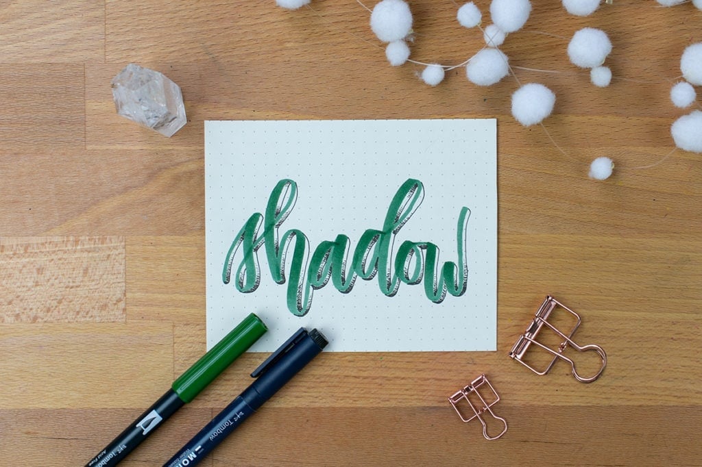
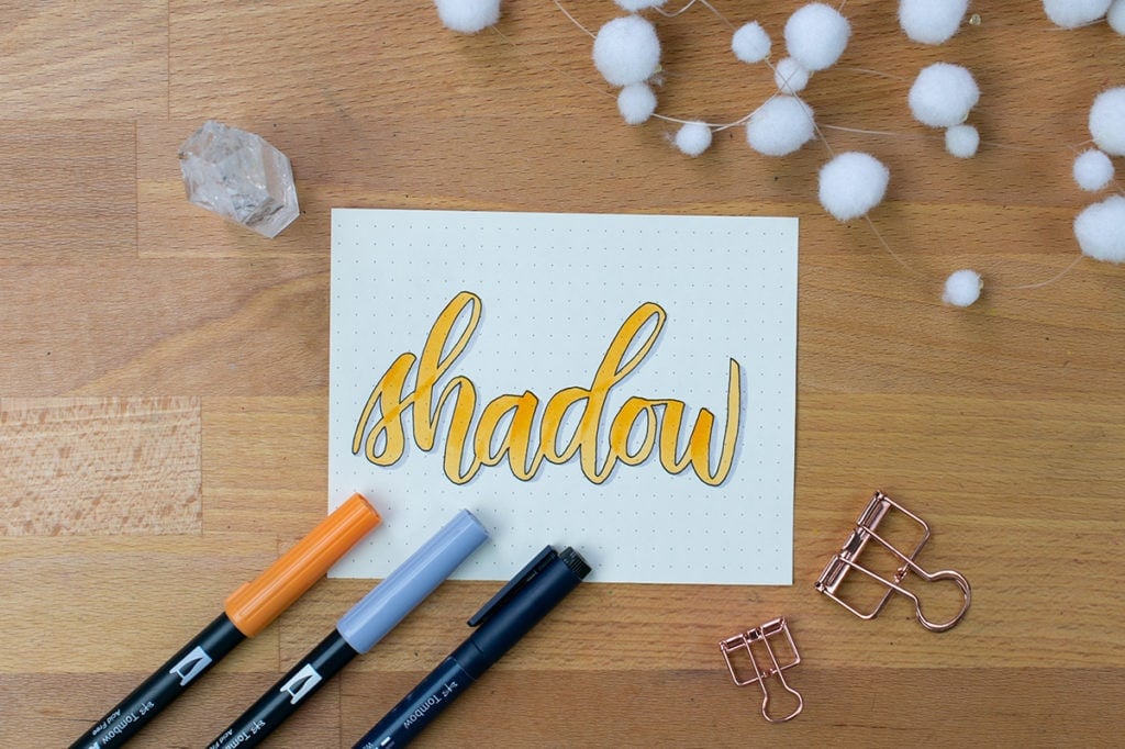
#8 – Two-Tone Shadow
If you have a few shades of the same color in your brush pen collection, put them to use with a two-tone shadow! Letter your word as you typically would. Then, use the lighter of your two shadow colors and create a shadow like you normally would. After that is finished, take your darker shadow color and create a darker shadow on top of the lighter color. I like to put the darker color along the bottommost parts of the letters, where shadows would be darkest.
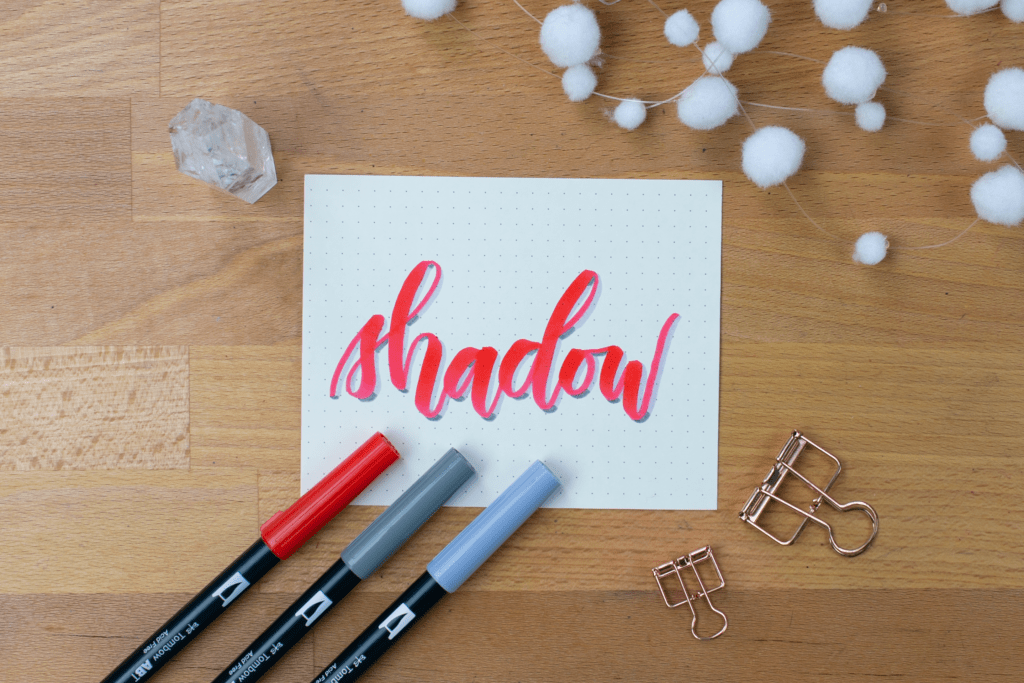
#9 – Shadow with Highlight
If you really want to make your lettering pop like whoa, then you just need to add highlights! Add a shadow in your favorite style. Then, using a white gel pen, add small lines on the opposite side of the shadows. Put your highlights near the edge of the letters, but not right against the outside. This will help give your brush lettering a light 3D effect and will make them look rounded, which is a very intriguing look. It helps to imagine where the light source would be, when placing the shadows and highlights.

Make Your Letters Pop
Creating fascinating brush lettering shadows is not nearly as hard as it looks. Whether you keep your shadows simple or combine several of the techniques listed here, you can make some extraordinary art. Practice different styles, incorporate different elements, and see what works for you. This list of 9 brush lettering shadows is by no means comprehensive, so feel free to explore and experiment until you are satisfied. Learning how to shadow letters is so much fun and worth every bit of effort, so I hope you try some of these techniques and make something amazing!


Great Examples!! And love the pictures I wish you had a worksheet that could go over the alphabet and show us where to shadow each letter and words. I just learn better with the worksheets and explaining lol but thank you for this
Thanks Audrey! I’m actually working on a shadows and highlights lettering workbook right now that should hopefully launch very soon. You can sign up for my email list here and be the first to know when it’s available!
Thank you for this article. I have been struggling with shadow and with was a great, quick way to refresh. I will keep this saved as a reference!
Sarah Mair
I’m so glad you enjoyed it, Sarah! Happy lettering!
Great examples, can’t wait to try them!
I’m glad you liked them! 🙂