3 Easy Lettering Styles to Try
Articles may contain affiliate links.
Type “lettering” into your google search bar and you will quickly be bombarded with a barrage of beautiful and varied lettering styles from around the world. While this eye candy can be oh so delicious, it can also be overwhelming for those looking to get started themselves. How do you know which style is right for you? Are there hand lettering styles that are easier to learn than others, or are you signing yourself up for a lifetime of practice sheets no matter what you try? Today I’m going to take the mystery out of 3 popular lettering styles and give you the insider tips on how to get started – the easy way!
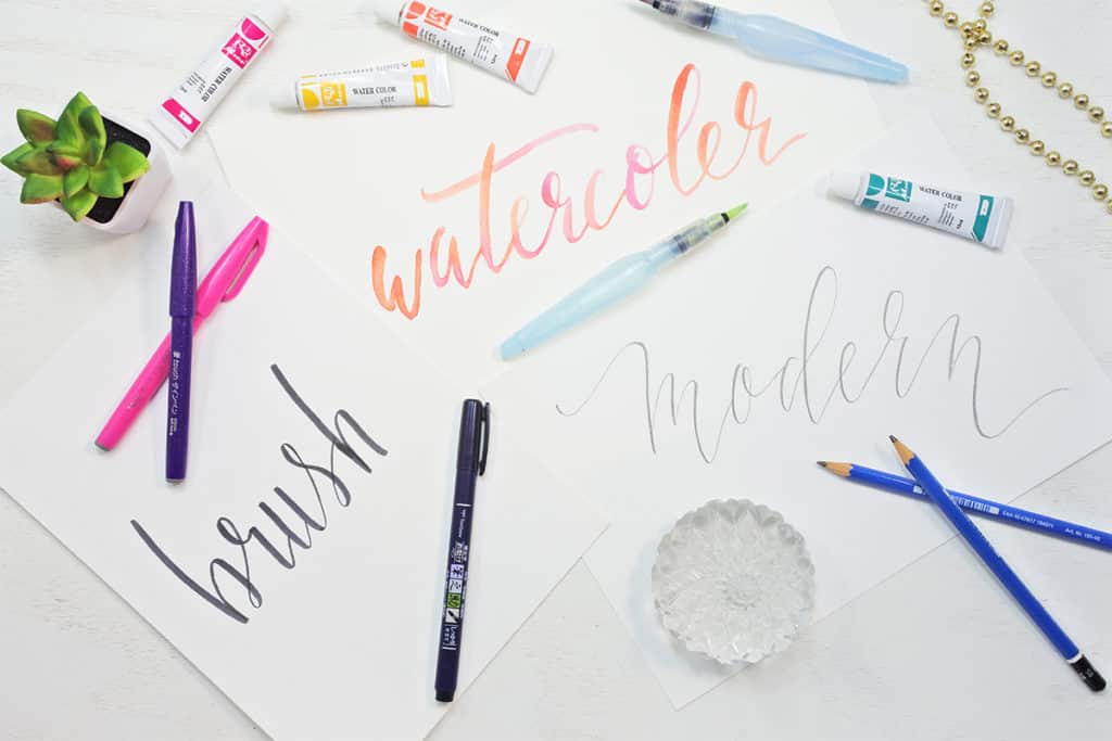
3 Lettering Styles
So let’s dive in and take a look at three lettering styles that are easier to master than you think!
1. Modern Calligraphy

What is Modern Calligraphy?
Modern calligraphy can be challenging to define because it technically covers a wide variety of fonts that are created using a pointed pen. But to put it simply, modern calligraphy is non-traditional calligraphy. Originally, for a piece of writing to be considered calligraphy, it had to follow strict guidelines. Traditional calligraphy styles such as Spencerian and Copperplate have definite rules on how to form each letter and everything has to look “just so.”
But in modern calligraphy, you can ignore the rules! This casual approach means you are free to get creative and go with your instincts. Add bounce, flourishes, anything goes!
But while there is a lot of freedom in the practice of modern calligraphy, there are some guidelines to keep in mind that will make your calligraphy more appealing – and more comfortable to write!
Modern Calligraphy Tips and Tricks
- Modern Calligraphy follows the standard thin up, thick down rule. This means everytime you stroke your pen upward you keep the pressure light, and every time you stroke your pen down, you apply a little pressure. But don’t overdo it! A hallmark of modern calligraphy is thin loopy lines that give it a whimsical, elegant look. Think back to the last wedding sign you saw on Pinterest and emulate that. Keep it thin!
- Modern Calligraphy almost always requires a pointed pen to accomplish those thin elegant lines. For most people, this means using a dip pen, with a flexible nib. But dip pens are difficult to master. But guess what? There is a much easier way to start practicing modern calligraphy. Use a pencil! That’s right; pencils are an excellent tool for creating those thin swoopy lines and bonus – you can erase mistakes! Using a pencil makes the practice of modern calligraphy approachable and affordable!
*Pro Tip – Use a drawing pencil that is at least 4b and up. The lead will be extra soft so you can easily make your downlines thicker while keeping your up lines super thin. A 4b pencil requires minimal pressure for maximum results!
2. Brush Lettering

What’s the Difference Between Lettering and Calligraphy?
In Hand Lettering you draw your letters, and in calligraphy, you write your words. Huh? Let me explain. Calligraphy fonts often require that you write each word entirely without lifting your pen. This means you have to be very familiar with each font and each letter’s form and you have to have excellent control over your hand. This requires practice with each font style and lots of it. But with hand lettering, you can lift your pen as often as you need, drawing each letter individually. This makes it an excellent technique for beginners because you can take your time and your hand control doesn’t have to be perfect to get good results!
There are many different tools you can use to hand letter with a wide range of difficulty – but we’re looking to do things the easy way today, right? There is one tool that can give you professional looking results with a minimum of practice – a brush pen! Brush pens are felt tip pens that come to a point at the end and are very flexible. They hold a lot of ink at one time, and the flexible tip makes those thick downlines super easy to make! You can learn more about brush pens in this post.
Brush lettering takes the bones of traditional calligraphy, and combines it with user-friendly materials and techniques, which makes it an excellent lettering style to get started with!
Brush Lettering Tips and Tricks
- There are a wide variety of brush pens on the market, but not all brush pens are good for a beginner. If you’re just starting out, avoid the long dual brush pens like Tombows. While they are terrific pens ( I own several ) the length and ultra flexible tips can be awkward in the hand and require some practice. For a beginner, I recommend the Tombow Fudenosuke or the Pentel Sign Touch. These pens are small and easy to handle, and the flexible tip gives you amazing results with a minimum of effort. They practically do the work for you! And the best part? They are extremely affordable! You can get a pack of 2 Fudenosuke pens for under $5!
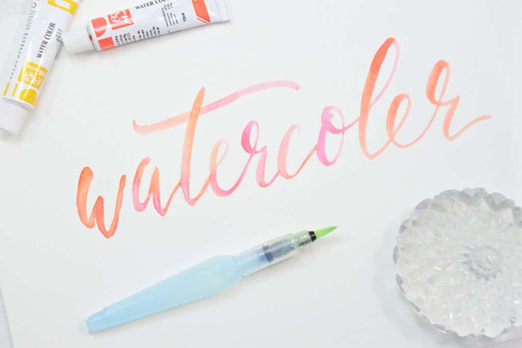
3. Watercolor Lettering

What is Watercolor Lettering?
Watercolor lettering uses essentially the same technique as brush lettering, but with different tools and mediums. Though this may seem to be the most intimidating style on the list, it’s actually quite easy! Watercolor is very forgiving and easy to work with, and you can easily cover up mistakes in what you create. Best of all, you have a wide range of colors to work with, and you can easily combine colors for a blended effect. Watercolor can give your lettering projects that wow factor with very little extra time and effort on your part.
Watercolor Tips and Tricks
- Many people when considering watercolor art, would automatically reach for a paintbrush. While this is fine, unless you have a lot of practice using watercolors and brushes, you will probably get inconsistent results as you reach up again and again to water your brush. But personally, I love to make things easier. There is one tool that makes watercolor lettering very accessible for beginners – the Pentel Aquash Water Brush Pen! That’s right, its a brush pen filled with water! Just give their soft, flexible bodies a little squeeze, and you’ve watered your brush! This makes it super easy not only to make traditional lettering strokes – it is a pen after all – but it also enables you to spread your color out across your letterforms. This gives you that watery blended look that makes watercolors so easy on the eyes.
- When you use a water brush pen, keep your pressure super light. Do not push down as hard as you would with your traditional brush pen. The water spreads out quickly, so don’t overdo it! Use a light touch, with very little pressure and the water, will do all the work for you!
Give These Lettering Styles a Try

Lettering can be intimidating, but you will find that your skills will develop quickly once you jump in. If you are looking for a bit more information before jumping in, check out this Ultimate Hand lettering Guide.
What lettering styles are you looking to try? Have you ever tried these techniques before? I’d love to hear your experience! Let me know in the comments!


Do you offer a course on the Times New Roman hand lettering? Not the brush lettering. Thanks.
Paula,
Unfortunately, at this time we only offer the brush lettering course, but I will look into doing a hand lettering specific course in the future.
I started using the Tombow Dual brush pens, and found it quite difficult. I think I will put those away, and try the Fudenoske pens first! Thanks for the tips Shelby!!
It can take a little practice but as you work with them it will get easier. Enjoy your Fudenoskes, Keri ?
I love all of these! I started brush lettering a couple months ago and I’m always looking for other variations on that! Thanks so much, and have a good weekend. (Also not to be *that* person, but I think you spelled watercolor wrong on you example – it’s still totally gorgeous though!)
Have fun with these new variations Hanna! It’s great to hear you enjoyed them 🙂