5 Tips to Take Your Lettering to the Next Level
Articles may contain affiliate links.
When I started bullet journaling, I was in awe of those people who created beautiful headings in their journals with brush pens. So I decided to learn how to brush letter myself. Brush lettering is a difficult skill to master, but once I did master it, I wanted more! Simple brush lettered headings in my bullet journal was no longer enough. Maybe you’re in that same position now. If so, then here are a few simple lettering tips that can take your lettering to the next level!

Lettering Supplies Used:
Lettering Tip #1: Add an Outline
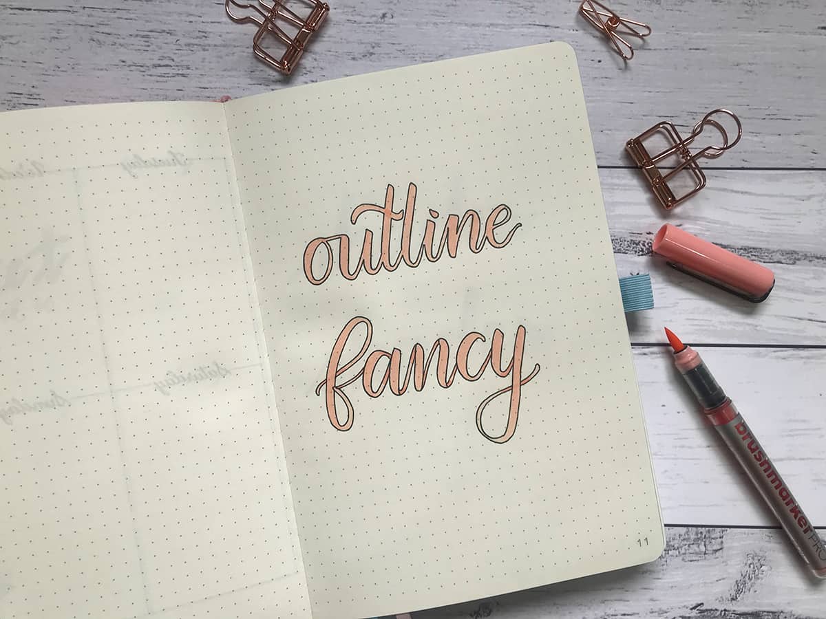
The simplest way to make your lettering pop is to add a black outline around the letters. After you’ve completed your lettering, use a fine liner to outline all your letters in one continuous line. This is especially effective if you’ve used a very light or pastel colour for your lettering.
To make this a bit more special, instead of just outlining with a continuous line, imagine that your lettering is actually a piece of ribbon. Add a black outline to the letters so that you can see the ribbon forming the word by identifying where your brush strokes have overlapped.
To add some extra dimension, using the same colour brush pen as your lettering, add some shadow where the overlap occurs.
Lettering Tip #2: Add a Drop-Shadow
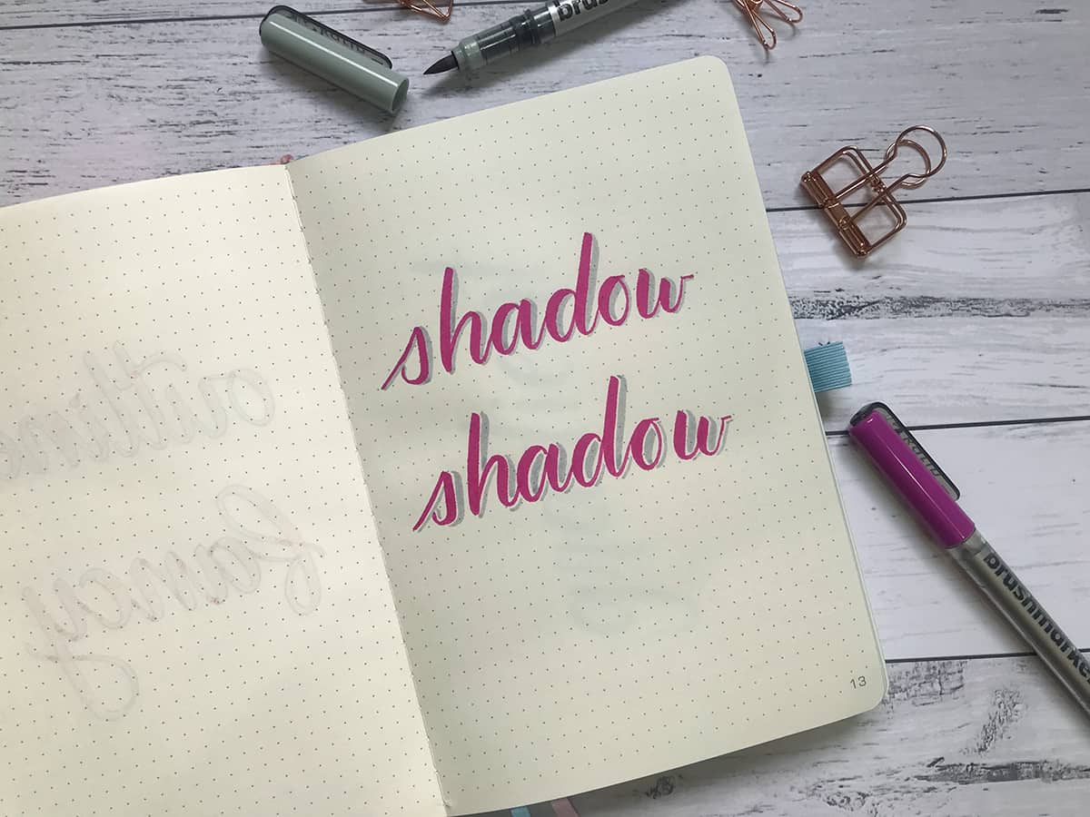
You can give your hand lettering a 3D appearance by adding a lettering shadow. Imagine there is a lamp sitting on your desk at the top left-hand corner of your page. This would cast a shadow to the right and towards the bottom of your lettering. Using a light grey pen, colour in this imaginary shadow.
You can mix this up by drawing the drop-shadow right up close to your lettering or leave a little space between your lettering and the drop-shadow, like in the second example below. Likewise, you can create your drop-shadow in different directions ie. Imagine your lamp is sitting on your desk at the top right hand corner of your page.
Lettering Tip #3: Create a Gradient or Ombre Effect
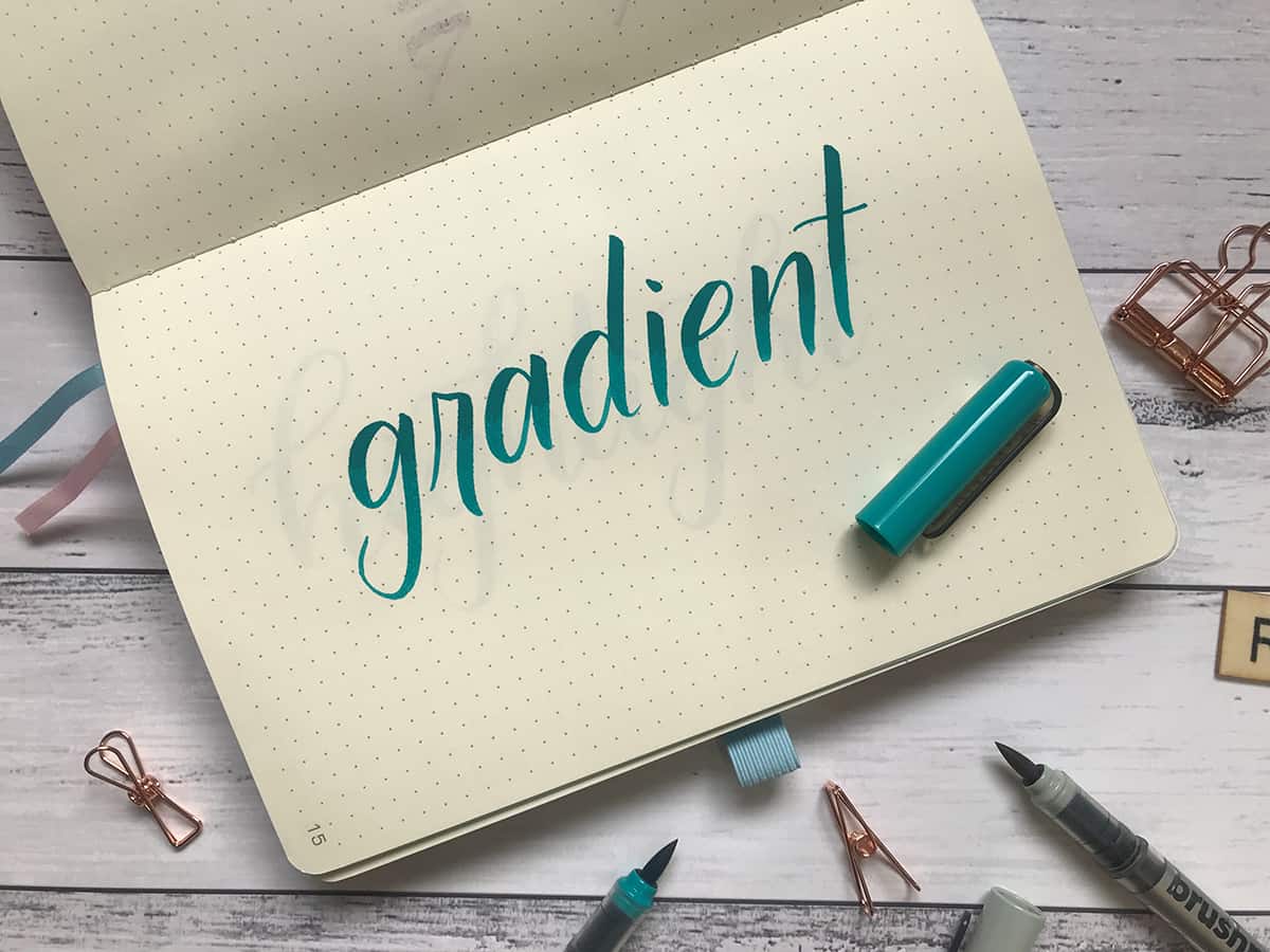
This lettering tip is incredibly simple. After you have completed your lettering, imagine a horizontal line halfway through your letters. Using the same pen as you initially used to create your lettering, go over the top half or your letters to make it a deeper shade. You can see here; the top half of the word is a deeper shade of green. You could also do this to the bottom half of your lettering instead of the top.
Lettering Tip #4: Add Highlights
Another very simple lettering tip to make your lettering pop is to use a white pen to add highlights. I’ve used a Uniball Signo white gel pen and drawn short lines on the thickest part of each letter. When using a white gel pen, try not to use too much pressure as this will stop the ink from coming out of the pen. Just use a light touch and you will find the ink flows from the pen easier and provides better coverage. If you find your white pen isn’t bright enough, wait for your work to dry and add another layer of white on top.
You can also use the white pen to decorate your letters with dots, tiny stars or stripes. Whatever you can imagine!

Lettering Tip #5: Use all the Tips Together!
Now after you’ve learned all these lettering tips, you can mix and match or use them all together!
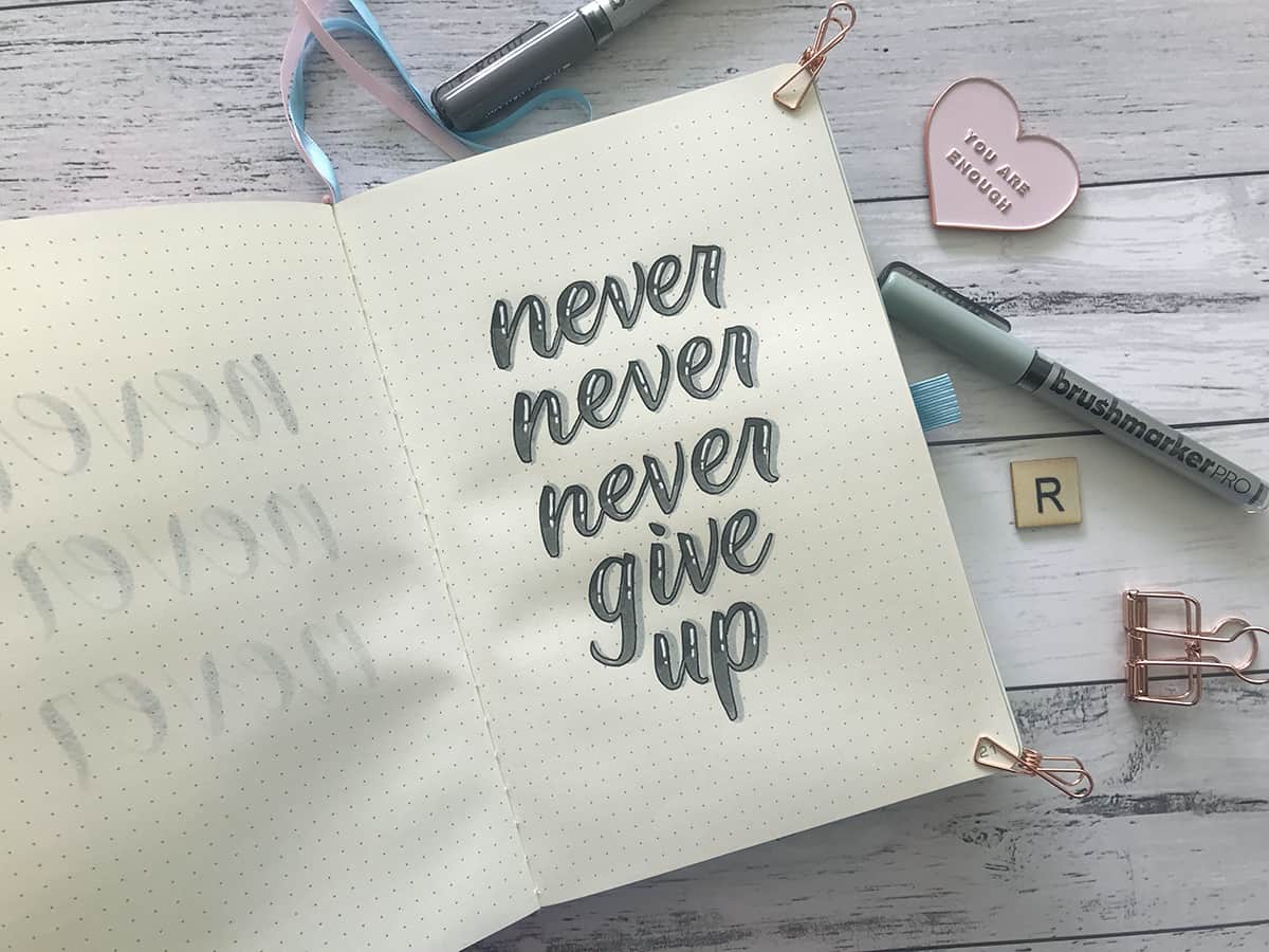
As you can see, all these lettering tips used together turned what could have been a boring grey quote into something so much more interesting created by a very skilled hand lettering artist!
Practice Makes Progress
I hope you found these tips useful and you give them a go in either your bullet journal or with any piece of hand lettering you do. If it doesn’t work out the first time you try it, remember that it all takes practice and as the quote says – Never, never, never give up!


