How to Draw 3D Letters: Create Lettering That Pops!
Articles may contain affiliate links.
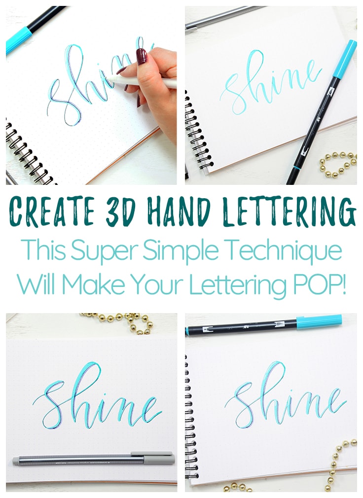
See how to easily learn how to draw 3d letters with this simple step-by-step tutorial. 3D lettering is one of my favorite techniques to teach because it easily ups the wow factor of your lettering.
How to Draw 3D Letters!
Today I’m joining Shelby to show you how easy it is to create beautiful 3D hand lettering! As a calligraphist, I always search and look for ways to up my game with new styles and techniques. Once you get started with hand lettering, it’s hard to stop! 3D hand lettering is one of my favorite techniques because it instantly and easily ups the wow factor of your lettering.
Drawing 3D Letters is Not Hard
But before we get started let me just address some myths about fancy hand-lettering that might be getting in your way. When you first fall down that rabbit hole that is hand lettering on the internet, the multitude of beautiful styles can be a bit overwhelming. Many people say “Oh, I could never do that, I have terrible handwriting!” But I’m here to let you in on a little secret – beautiful hand lettering has almost nothing to do with your handwriting! The function of handwriting is for imparting information quickly and efficiently. Hand lettering is more like drawing than writing. You take your time and concentrate more on the shapes you’re forming than the message of the words. So whether you were blessed with good handwriting or not, the skill of hand lettering is well within your reach! And it’s easier than you think!
So shake off that insecurity and let’s dive into the “easier than you think” world of 3D lettering!
Materials You Need:
- Quality paper – such as a Rhodia Dot Pad
- Brush Pen – Tombow Dual Brush Pens work great!
- White pen
- Thin black pen – Such as Microns
- Grey marker
How to Draw 3D Letters: Step-by-Step
Step One – Write Out Your Word
For practice, pick a word you love and are comfortable writing. Choose something with letters that are easy and fun for you to write. For instance, I love to write the letters b and h because I love those big loopy ascenders! (For more info on ascenders, check out our ultimate guide to hand lettering!) On the other hand, the letter k feels awkward for me to write. Everyone is different so take note of what you’re comfortable with and stick with it! When learning a new technique it’s always best to work with yourself! No reason to make things harder than they have to be!
Now that you’ve chosen your practice word, write it out in your favorite hand lettering style. It can be anything you’re comfortable with, and I mean ANYTHING! Modern calligraphy, traditional cursive, block letters, you name it! This technique works across the board to enhance multiple styles of writing.
Don’t make your letters too thin, as we want to leave room for some highlights. A good rule of thumb to follow is thick down, thin up. This means that you apply pressure on your downlines to make them thicker, and keep the pressure as light as you can every time a letter strokes upward.
Step Two – Create a Base for Your Shadows
The key to learning how to draw 3D letters is figuring out lettering shadows and light. So first you decide where your light is coming from. Typically you’ll pick either the right side or the left; however, the top and bottom are also an option. For the sake of simplicity, I tend to go with the left side. The light and the shadows will always be on opposite sides from each other.
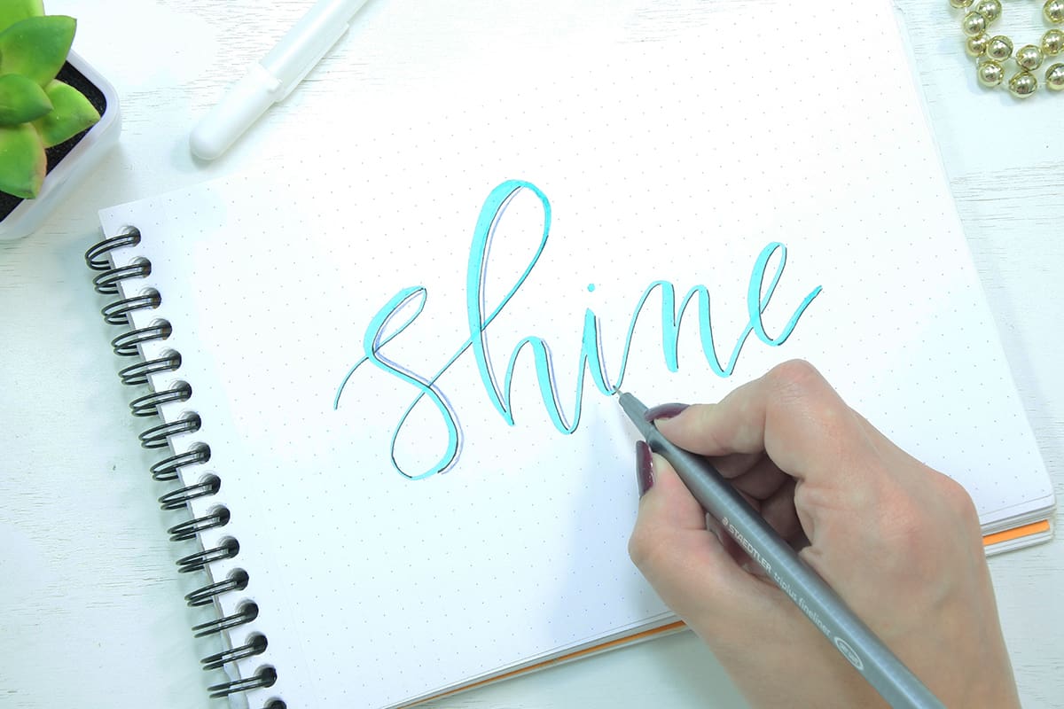
Once you’ve chosen a side, take your thin black pen and carefully trace along the edge of your letters. Be sure to only trace on one side of each line!
These black lines are key to making your letters pop! They also create some definition and give your lettering a polished clean look.
Step Three – Draw in Your Shadows
Next, take your grey marker and carefully trace the shape of your letters just slightly outside those black lines. be careful not to go above or below where you’ve traced your black lines.
Now color it in!
Step Four – Create Your Highlights
Now it’s time to lighten up – literally!
Take your white pen and find the upper left-hand corner of each of your letters. Close to the edge of each letter, draw a short white line. The thickness of this line will depend upon how thick your letters were to begin with.
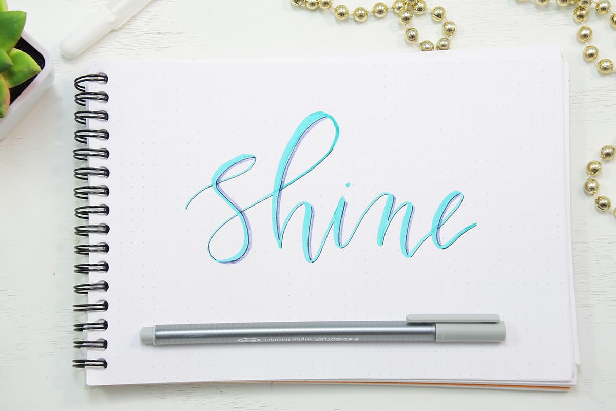
And Voila! You’re done! See how easy that was? Eye-popping 3-D hand-lettering in four easy steps!

It’s Really That Easy to Draw 3d Letters
Results like these can really boost your confidence in your hand lettering skills!
Have you tried this technique before? How did it go? What else are you dying to learn about hand lettering? Let me know in the comments!


Wow beautiful letter design. Thanks for sharing.
Thanks for the tips and clear illustrations, however, you have confused me! You stated that you usually choose the left side to highlight but here, you chose the right side. Why? I was taught formal calligraphy in Ireland decades ago and we were given a rule for highlighting (using gold leaf) which I cannot clearly recall. I think it was 1. ‘left and under’ (or over?) or 2. ‘right and over’ (or under?) I was hoping to get clarity from you. I am spatially challenged (!) so would appreciate your expertise.
I love your work! Thank you for sharing your artistry and passion. Your post inspire me to do just a little more 🙂
That is so kind of you Rosa! Thanks so much for being here.