Color Theory Basics
Articles may contain affiliate links.
Every person must learn color theory basics if they aspire to become a skilled artist.
But what is color theory in simple terms?
Simply put, color theory is the art and science of combining colors. It uses general rules and guidelines to explain how colors relate to one another. Color theory is often used by artists, designers, marketers, and other creative professionals in their work.
As you can see, it’s important to have a solid understanding of the basics so that you know how to use harmonizing color palettes in your artwork.
But, instead of deep diving into the complexity of color theory, let’s keep things simple by having a look at the basics.
What Are the Primary Colors?
You more than likely learned about primary colors in elementary school.
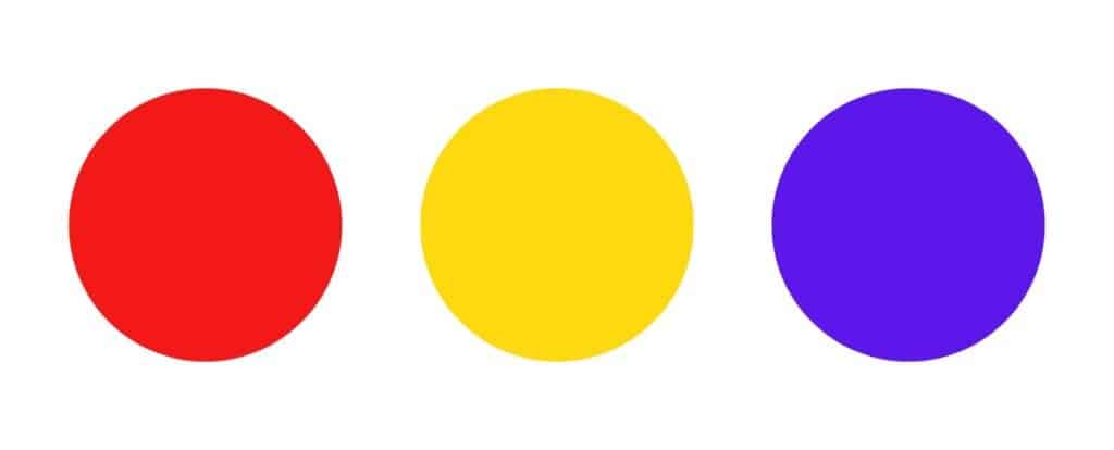
But, in case you’ve forgotten about them, here’s a quick review. The primary colors are:
- Red
- Yellow
- Blue

These colors are called “primary” because no other colors can be mixed to create red, yellow, and blue.
You can mix the three primary colors in countless ways to produce a huge variety of different colors.
For instance, let’s have a look at the secondary colors.
What Are the Secondary Colors?
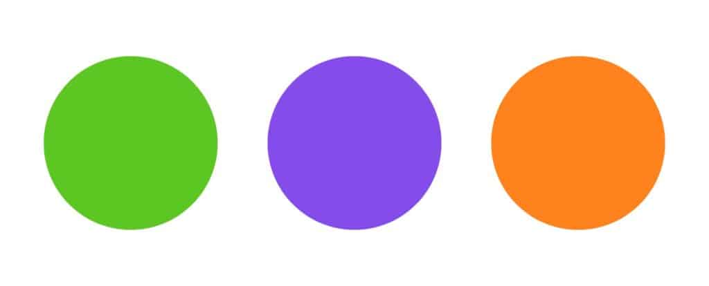
The secondary colors are green, purple, and orange.
You can mix a combination of two primary colors to create a secondary color. Here are the basic color combinations:
- Yellow + blue = green
- Blue + red = purple
- Red + yellow = orange

Now, let’s take it one step further by going over some simple color theory terms that all artists should know.
Color Theory Basics for Artists
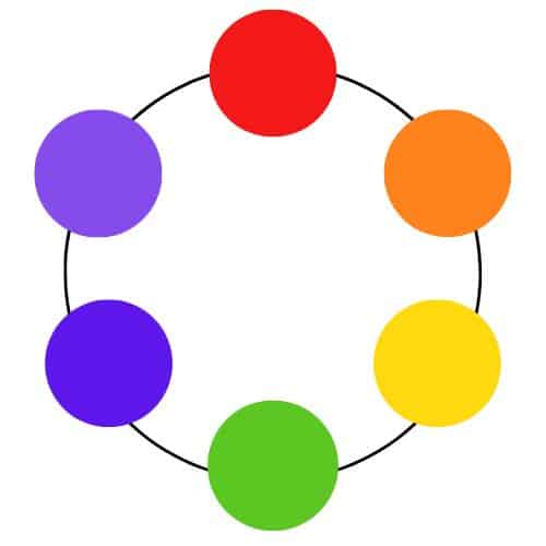
When you look at a simple color wheel, you’ll see all the primary and secondary colors side by side in a circle.
These colors belong to two main categories: warm and cool colors. They are as follows:
- Warm colors: red, orange, and yellow. They are cheerful, fiery, and spicy.
- Cool colors: blue, purple, and green. They are chilly, calm, and serene.
To learn more about how color affects mood, check out this article which explains how to use color psychology in art.
Next, there is some terminology that you need to become familiar with to understand the relationships between the colors. They are as follows:
- Complementary colors: They are directly opposite one another on the color wheel. For example, red and green are complementary colors.
- Analogous colors: They sit next to one another on the color wheel. For example, green, blue, and purple are analogous colors.
- Tertiary colors: They are made by mixing a primary color and a secondary color together. For example, yellow-green is a tertiary color.
You need to be careful when mixing complementary colors together because they often create muddy browns. So, be cautious when using these colors side by side in your artwork.

Learn More About Color Theory: Next Steps
Congrats on finishing this crash course in color theory basics!
Now, you might be wondering: “How do I learn more about color theory?”
Well, the best way is to enroll in the course Watercolor Lettering: Learn To Blend Colors And Letter Boldly With Watercolors!
In this course—which is offered exclusively on Foxsy—you have ample opportunity to learn about blending and mixing colors with your watercolors.
So, click the link above to learn more!


