Bounce Lettering: 6 Easy Tips + Free Printable Worksheet
Articles may contain affiliate links.
Over the past few years, bounce lettering has popped up everywhere in the design world — blogs, advertisements, product packaging, and home decor… just to name a few! This lettering style looks fun and full of life, so it’s no wonder that creatives everywhere are clamoring to learn this method. In this post, I’ll show you everything you need to know to conquer bounce lettering and add this exciting style to your creative toolkit.
What is Bounce Lettering?
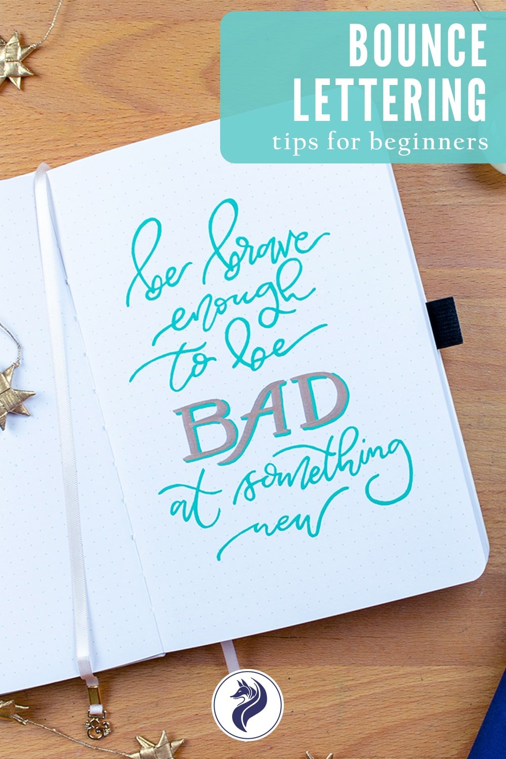
You might wonder what makes bounce lettering different from normal hand lettering. Well, it’s really all in the name! Bounce lettering is a style of lettering where you buck the norm of writing in a straight line. Instead, you add some variation to the position of the letters, giving them the appearance of bouncing. This style is whimsical, fun, and packed full of personality. You don’t need any particular pens or makers to do this method — it works with whatever tools you have. It’s no wonder that bounce lettering has become a beloved style in the hand lettering and design community!

How to Do Bounce Lettering
While the style might be fun and easy-going, it can difficult to master. It takes quite a bit of time and practice to create a bounce lettering effect that looks fluid and effortless. That being said, it is worth every bit of effort to learn this trendy and useful lettering method.
The Anatomy of Letters
To achieve bounce lettering, you need to break a few lettering rules. In order to break those rules, you need to know and understand them well.
When you are learning lettering, one of the first things you need to master is the basic letter anatomy of the alphabet. I explain letter anatomy in-depth in my hand lettering quick start guide, but I’ll give you the quick and dirty version here. Essentially, there are four parts of a letter that you need to know.
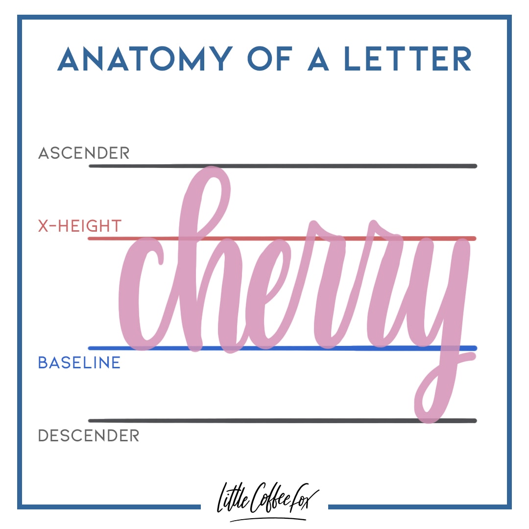
The Baseline: This is where the bottom of all letters sit on a line, providing a base for all the other parts of a letter.
The X-Height: This is the top point of the main body of a letter. All the letters in the words should have the same X-height for a clean and consistent look.
The Ascender Line: Letters like l, t, h, f, and d have an extra arm that rises higher than the X-height. These lines, or ascenders, reach to the top line, called the ascender line.
The Descender Line: Letters like g, y, j, and p have an extra line that falls below the baseline, and this line is called a descender. The descenders reach to the descender line.
Break the Rules
Now that you understand how letters are supposed to sit on a clean, straight line, you can learn how to break those rules when you write. Bouncy fonts buck the idea of keeping all the letters on a single baseline. Instead, each letter jumps a little higher or a little lower than the baseline, creating a bouncy style. Generally, all the letters are still roughly the same size — the X-height of all the letters should be approximately the same, even if they don’t sit on the same line.
Try to Achieve Balance
There isn’t a specific right or wrong way to achieve bounce lettering. Mostly, you have to feel out what looks the best to you. However, one thing you can pay attention to while you’re lettering is the balance of the word. If you were to draw a line right through the middle of a word, you want to make sure that there is plenty of weight above and below that line. If you have too many letters dip low and not enough above to balance it out, the whole thing can look a bit off.
The trick is to pay attention while you are lettering and try to immediately counterbalance the last two letters. If you have a few letters bouncing high, try to make sure the next few strokes go low to balance it out. Often, this requires some improvisation in the middle of your lettering. With a bit of practice, you will develop an eye for balance and figure out what works best.

6 Tips for Practicing
The best way to learn bounce lettering is to practice it again and again. Try new combinations of highs and lows to find a bounce that pleases you. There will be plenty of times where you create something that just doesn’t work. Learn from these bouncing failures to try again and make something better.
There is no proper way to learn this method, but I have picked up a few tricks along the way that might make your journey easier.
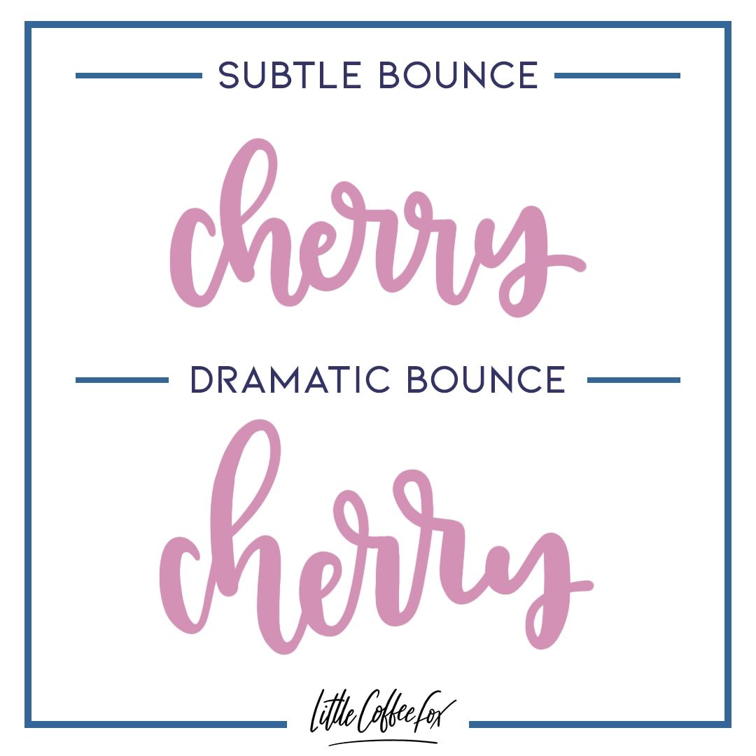
Exaggerate the Bounce
When you’re learning, it helps to make big, bold bounces so you can get a feel for the style. It’s harder to practice when you’re keeping it subtle. Really let your letters bounce around so you can play with the shapes and balance of the word.
Letter on a Line
Draw a line (or use the lines on the piece of paper) and use it as a center point in your word. This will help you keep an eye on the balance of your lettering while you practice.

Go Dramatic with Shapes
Let your letters have a little dramatic flair! Bounce lettering is a great time to let loose with your style. For example, you can letter an m or n with extra swooshy humps, or let the loops of ascenders and descenders get extra loopy. Play around and have fun!
Dip and Reach
Give your letters a bit more reach for the bounce effect. When a letter begins with an upstroke or ascender, try letting it really jump up high. If it ends with a downstroke or descender, let it dip a bit more dramatically. This gives extra bounce to your letters, which can help you get a more playful effect. This also allows you a little more leeway to connect cursive letters to each other.

Don’t Worry About Weight
If you’re new to brush lettering, you might be tempted to try to bounce lettering with a brush pen. While you certainly can try, you may find that it makes both practices harder. Try using a bullet tip or felt tip pen instead of a brush pen to practice bounce lettering. Once you get a feel for the ups and downs of bouncing, you can add the extra complication of line weight with a bit more confidence.
Offset Double Letters
Double letters can be a little intimidating. If you’re not careful and the two are too close, they can throw off the whole bounce of a word. I find that the easiest approach is to offset them from each other. Have the first of the two letters start a bit high, then slot the second letter in below. Or go the opposite way, starting low and ending high. Just make sure to have a clear bounce between the pair and you should be fine!

Grab My Free Bounce Lettering Practice Sheet
Want a bit of extra guidance while you practice your own lettering? Download my free worksheets today! Just sign up for the Fox Den Resource Library to grab access to dozens of freebies, including bullet journal printables and more lettering worksheets. Already a member of the Fox Den? Use the password from your welcome email to enter the library and get your practice sheet now!


I see this on so many crafts and sometimes it’s difficult to read.
I appreciate this so much! Really really helpful tips and info I haven’t seen thus far on my journey mastering faux calligraphy bounce lettering and such. Definitely brought me a giant step forward .